


Personally, I find the color wars intriguing but not life-changing. If you don’t know what I am talking about, perhaps I should explain. Every year at the end of the year, or midyear in the case of one company, paint and design companies crown their “Color of the Year.” It’s supposed to be a fun insight into what colors will be popular, but as with anything, it has become a controversial, competitive topic. Some years, everyone agrees and the colors are generally well received (looking at you, millennial pink). This year, a few were standard. Behr chose a deep turquoise called Hidden Gem, a “hue that exudes quiet confidence.” IKEA chose “Rebel Pink,” which is a color all about “playfulness and passion,” according to IKEA’s Home Furnishing Direction Leader.
Three big ones turned out to be fairly disappointing. Benjamin Moore named Silhouette for its “refined elegance, luxurious burnt umber with delicate notes of charcoal.” It looks like a dark grayish brown. Sherwin-Williams decided on Universal Khaki, choosing “strength in simplicity,” with what appears to be a fairly generic off-white.
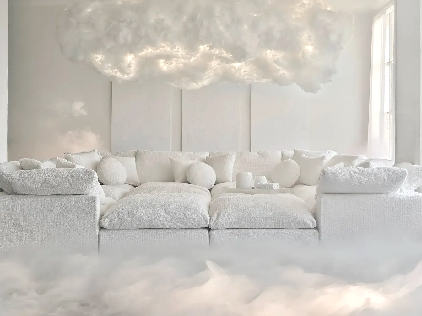
But none caused more controversy or disappointment than when Pantone, a company dedicated to standardizing the print standards of color since 1963, declared “Cloud Dancer” the color of the year. Pantone describes Cloud Dancer as “a lofty white that serves as a symbol of calming influence in a society rediscovering the value of quiet reflection. A billowy white imbued with serenity, Cloud Dancer encourages true relaxation and focus, allowing the mind to wander and creativity to breathe, making room for innovation.” To be clear, the color is white. Just white. The color of every wall of every rental I ever leased. The color of blank paper. The color of nothing. Pantone does not let that stop them.
In their press release, they note:
As the team began discussions for the Pantone Color of the Year 2026, it became clear to us that we are living in a transitional time where people are seeking truth, possibility, and a new way of living. Overcommitted and overstimulated in our 24/7 hustle culture, we’re looking for respite and relief from emotional and physical stimulation by disconnecting and stepping away from the incessant demands of daily life to deeply rejuvenate mentally, physically and emotionally. Bombarded with a cacophony of noise and conflicting messages, we’re attempting to remove distractions so we can find clarity and simplicity. We’re looking for fulfillment by opting for a quieter, less fussy life and serenity for a lightness of being. Uncertain of what the future holds, we’re trying to find the place where we belong. Yearning for authentic human connections and real-life experiences, we want to share without filters or spectacle, rediscover the value of moments and find joy in life’s simple pleasures.
To be fair to Pantone, they seem to have their finger on the pulse. We are overwhelmed, we are stressed, we are looking for human connection and certainty. It just seems a bit much to expect the color white to fulfill all of our most human desires.
Painting walls white or khaki or dark brownish gray is a recent trend and one that seems to be tied to the rise of social media (what can’t we blame on it?). Last month, I began researching the ubiquity of colors and styles for an article that will be published in the upcoming Beauty issue of The Mockingbird magazine. What became clear to me was that our ideas of beauty are being shaped by our internet lives. Even if you do not participate in social media, home design is also driven by magazines, which more and more are owned by the same few corporations, pushing the same general products and vibes.
In a Wall Street Journal article titled “Why White Walls are Instagram Gold,” journalist Abbey Crain interviewed Instagram creators and interior designers who said that there was a direct correlation between white walls and an increase in followers. One argued it made her home decor stand out. Another pointed out that the light will bounce around and make you and your surroundings glow. In a post “The White Wall Controversy: How All-White Aesthetic Has Affected Design,” Grace Bonney of Design*Sponge said that “at least 90% of the homes we see every month (we reach out to and get submissions from hundreds of people around the globe on a regular basis) have ‘that’ look: white walls, a mix of vintage kilim rugs, lots of house plants, and a carefully curated selection of found/salvaged objects.”
Some of this is because our ideas of what is beautiful and worthy of living with is directly impacted by these forces outside of us — the internet, the rise of HGTV, the cheap home decor we can find everywhere from Target to HomeGoods. Our individual tastes are becoming less particular and more universal. Look at every coffee shop around — white walls, reclaimed wood shelves and counters, word art or black and white prints, the same mid-century modern seats and tables.
Some of this is financially motivated, not merely because white walls attract more followers but also because it’s an easy color to work with and sometimes costs less than other colors. You can do a lot with a white background.
People critique Pantone for choosing white as the color of the year but honestly, it seems spot on. In physics and light, white is a combination of all the colors. What better way to point to the fact that so much of our aesthetics are becoming a general mass-produced vibe?
Home decor and fashion, really all of the aesthetic arts, are becoming more homogenous. We want to be seen as people in the know, people who are aware of trends and style, so we copy each other. I say this as someone who painted many walls white or greige, loves a kilim rug, and owns the same barstools as everyone’s favorite home influencers. There’s tremendous pressure to be unique but also fit in, which is ridiculous and pretentious. For those of us millennials who came of age in the era of Fixer Upper and Property Brothers, we spend 23% more on home decor than our boomer counterparts. Changing home decor is a way to keep up with the proverbial Joneses, and we are all trying our best to have the right style.
But, keeping up with these other people, whoever they may be, or trying to have the perfect aesthetic vibe is not solving anyone’s problems. Hoping for love and admiration based on your chosen wall paint is as ridiculous as believing that your Color of the Year can somehow bring about peace, harmony and understanding. Comparing ourselves (or our homes) to one another is just another empty way we try to find love.
We are so much more than our favorite colors or our design aesthetic. Your favorite colors do not define you, even if my favorites of navy blue and gray do point to a more traditional personality, which some may call boring. I am not made to live in an orange house, or even a yellow one. I love navy and gray and think maybe I was made that way. My best friend’s home is chock full of pink. She loves it and always has.
There is nothing wrong with loving basic colors or bright ones. We tend to assign value to style based on our own preferences. Being on trend, whether in fashion, home decor, music taste, etc., gives us the feeling of being on the inside of the group, which often feels better than being on the outside. My fear in our generalization of aesthetics is that we lose the expansive vision of beauty that the God who created every color has set before us. When we begin to cut down on who is in, what is beautiful, what is good, we lose sight of the nature of a God who somehow created both the flamingo-tongued sea slug and the magnificent bald eagle; the silver gray of birch bark and the scarlet red of a sunset.
Whether you love Cloud Dancer White or wish for the days of magenta and turquoise accent walls, perhaps it is the equivalent of when Jesus talks about the birds of the air and the flowers of the field in Matthew 6. He says, “And why do you worry about clothes? See how the flowers of the field grow. They do not labor or spin. Yet I tell you that not even Solomon in all his splendor was dressed like one of these. If that is how God clothes the grass of the field, which is here today and tomorrow is thrown into the fire, will he not much more clothe you — you of little faith? So do not worry” (Mt 6:28–31). Cloud Dancer white may fail us, but these words of Jesus do remind us that we’ve already found the place we belong.


I love how you’ve found spiritual truth while sorting through the new color trends. Its a good reminder that so many things matter to us because we are trying to find love and acceptance- which Christ has in spades.
Thanks for this JG – I’ve been thinking about this a lot lately. I think the influencer part is a big deal, but also, our cameras on our phones mean that our homes aren’t just witnessed by our beloved non-judgmental guests, but all sorts of strangers online too that are much less restraining with their tastes. It’s like keeping up with the Joneses on every block in every city in every state. It’s all too much. I have a dark teal room with white trim, dark brown LVP faux wood floors, a large red wall sign with lights, and modern furniture. It’s awesome and I love it, but I get stomach butterflies thinking I’ll have to paint it all white when it comes time to sell it.
Apparently Cloud Dancer White is here to calm our anxious age. Which is impressive for a paint color. I like white because it makes rooms look bigger and forgives imperfect trim. But when anxiety shows up at 2 a.m., I’ll stick with something a little more eternal. Paint trends fade. Jesus lasts forever. Thanks Jane!
I love this, Jane! Thank you for sharing.
Wish you didn’t knock Target & Home Goods (offering inexpensive ways to be trendy & experimental). And prefer to see white, light, as the full spectrum of all colors. No favor. As in God said “let there be light”. No more prescriptive or magnificent than that!